
A Guide to Calibration Plots in Python
When I build a machine learning model for classification problems, one of the questions that I ask myself is why is my model not crap? Sometimes I feel that developing a model is like holding a grenade, and calibration is one of my safety pins. In this post, I will walk through the concept of calibration, then show in Python how to make diagnostic calibration plots.
Here’s link to the Jupyter notebook for this post
Evaluating probabilistic predictions
Let me start by explaining what calibration is and where the idea came from.
In machine learning, most classification models produce predictions of class probabilities between 0 and 1, then have an option of turning probabilistic outputs to class predictions. Even algorithms that only produce scores like support vector machine, can be retrofitted to produce probability-like predictions.
For a binary classification problem, there are summary metrics — accuracy, precision, recall, F1-score, and so on — that evaluate the quality of binary 0s and 1s outputs. If the outputs are not binary but are floating numbers between 0 and 1, then I can use them as scores for ranking. But floating numbers between 0 and 1 scream probabilities, and how do I know if I can trust them as probabilities?
A model’s output can be viewed as a statement saying how likely something should happen. An example of such a model — whose statements I check every day before leaving my house — is the weather service. In particular, how likely is it going to rain?
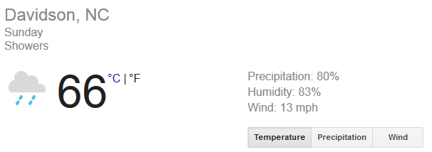 image from weather.com
It says on Sunday, there’s an 80% chance of rain. How trustworthy is this 80% call? If I dig into weather.com’s past forecasts and found that 8 out 10 days are rainy when they called an 80%, then I can convince myself to load up my audiobooks and prepare for crazy traffic on the highway in the afternoon.
In other words, an accurate weather forecast means that if I looked into 100 days that are predicted with an 80% chance of rain, then there should be around 80 rainy days. It also has to be accurate in other probability ranges. For days that are called to rain 30% of the time, there should be 30 rainy days out of 100 days on average. If this weather forecast service’s predictions all follow this good pattern, then we say their predictions are calibrated. It’s the probabilistic way of saying they hit the nail on the head.
- A probabilistic model is calibrated if I binned the test samples based on their predicted probabilities, each bin’s true outcomes has a proportion close to the probabilities in the bin.
How do I assess calibration? Instead of summarizing calibration into a single number, I prefer making calibration plots.
Calibration plots are often line plots. Once I choose the number of bins and throw predictions into the bin, each bin is then converted to a dot on the plot. For each bin, the y-value is the proportion of true outcomes, and x-value is the mean predicted probability. Therefore, a well-calibrated model has a calibration curve that hugs the straight line y=x. Here’s an example of a calibration plot with two curves, each representing a model on the same data.
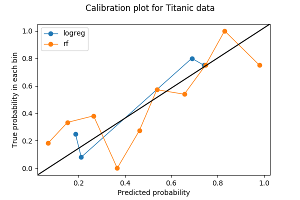
I’m going to show how I made this plot in Python and what I saw in it.
A Python example
The first thing to do in making a calibration plot is to pick the number of bins. In this example, I binned the probabilities into 10 bins between 0 and 1: from 0 to 0.1, 0.1 to 0.2, …, 0.9 to 1. The data I used is the Titanic dataset from Kaggle, where the label to predict is a binary variable Survived.
I am going to plot the calibration curves for two models — one for logistic regression, and one for random forest. Both models produce class probabilities on Survived based on two features Age and Sex.
+----+------+--------+
| Age|   Sex|Survived|
+----+------+--------+
|22.0|  male|       0|
|38.0|female|       1|
|26.0|female|       1|
+----+------+--------+
Preprocessing
Before training my models, I filled the missing values in Age with its mean and also turned Sex into a numeric variable with values 0 and 1.
import numpy as np
import pandas as pd
import matplotlib.pyplot as plt
from sklearn import preprocessing
from sklearn import model_selection

titanic = pd.read_csv('train.csv')

fitted_age_imputer = preprocessing.Imputer(axis=1).fit(titanic['Age'].values)
titanic['Age_imputed'] = fitted_age_imputer.transform(
    titanic['Age'].values.reshape(1, -1)
    ).transpose()

titanic['Sex_coded'] = np.where(titanic.Sex == 'female', 1, 0)
Then, I split the data into training and validation set by a 80/20 split.
from sklearn import model_selection
feature_cols = ['Age_imputed', 'Sex_coded']
feature_train, feature_test, label_train, label_test = (
    model_selection.train_test_split(
        titanic[feature_cols],
        titanic.Survived,
        test_size=0.2,
        random_state=1)
    )
Training and predicting
I can now train a logistic regression model on my training set and predict on the validation set.
from sklearn.linear_model import LogisticRegression
logreg_model = LogisticRegression().fit(X=feature_train,y=label_train)
logreg_prediction = logreg_model.predict_proba(feature_test)
Similarly, train a random forest model and predict on the validation set.
from sklearn.ensemble import RandomForestClassifier
rf_model = RandomForestClassifier(random_state=1234).fit(X=feature_train, y=label_train)
rf_prediction = rf_model.predict_proba(feature_test)
The positive class probability is returned by the models in the second column (index=1):
logreg_prediction[:5]
array([[ 0.30439638,  0.69560362],
       [ 0.80800552,  0.19199448],
       [ 0.24986814,  0.75013186],
       [ 0.271399  ,  0.728601  ],
       [ 0.23373554,  0.76626446]])
Calibration Plot
Once I have the class probabilities and labels, I can compute the bins for a calibration plot. Here I use sklearn.calibration.calibration_curve that returns the (x,y) coordinates of the bins on the calibration plot.
from sklearn.calibration import calibration_curve
logreg_y, logreg_x = calibration_curve(label_test, logreg_prediction[:,1], n_bins=10)
Note that although I asked for 10 bins for logistic regression, 6 bins out of 10 don’t have any data. The reason is a combination of that logistic regresion being a simple model, that there are only two features, and that I have less than 200 points of data in the validation set.
[logreg_y, logreg_x]
[array([ 0.24719101,  0.08      ,  0.8       ,  0.75      ]),
 array([ 0.18667202,  0.21127751,  0.68840625,  0.73992411])]
Next, I compute the coordinates for the bins of random forest model.
rf_y, rf_x = calibration_curve(label_test, rf_prediction[:,1], n_bins=10)
Now I can plot the two calibration curves. To make the plot easier to read, I also added a y=x reference line based on a StackOverflow answer.
%matplotlib inline
import matplotlib.pyplot as plt
import matplotlib.lines as mlines
import matplotlib.transforms as mtransforms

fig, ax = plt.subplots()
# only these two lines are calibration curves
plt.plot(logreg_x,logreg_y, marker='o', linewidth=1, label='logreg')
plt.plot(rf_x, rf_y, marker='o', linewidth=1, label='rf')

# reference line, legends, and axis labels
line = mlines.Line2D([0, 1], [0, 1], color='black')
transform = ax.transAxes
line.set_transform(transform)
ax.add_line(line)
fig.suptitle('Calibration plot for Titanic data')
ax.set_xlabel('Predicted probability')
ax.set_ylabel('True probability in each bin')
plt.legend()
plt.show()
Comments on the plot
Bin totals and discrimination
There are only 4 nonempty bins for logistic regression when I asked for 10 bins. Is this a bad thing? Let’s use a function that I took from the source code of sklearn.calibration.calibration_curve to find out which ones are the missing bins.
def bin_total(y_true, y_prob, n_bins):
    bins = np.linspace(0., 1. + 1e-8, n_bins + 1)

    # In sklearn.calibration.calibration_curve,
    # the last value in the array is always 0.
    binids = np.digitize(y_prob, bins) - 1

    return np.bincount(binids, minlength=len(bins))

bin_total(label_test, logreg_prediction[:,1], n_bins=10)
array([ 0, 89, 25, 0, 0, 0, 5, 60, 0, 0, 0], dtype=int64)
The missing bins have midpoint values of 5%, 35%, 45%, 55%, 85%, and 95%. In fact, having low totals or empty bins in the middling bins (30-60%) may actually be a good thing — I want my predictions to avoid those middling bins and become discriminative.
Discrimination is a concept that goes side-by-side with calibration in classification problems. Sometimes it comes before calibration if the goal in building a model is to make automatic decisions rather than provide statistical estimates. Imagine the scenario where I have two weather models and I live in Podunk, Nevada where 10% (36 days per year) of days are rainy:
- model A always say there’s 10% chance of rain no matter which day it is.
- model B says it’s going to rain every day in June (100%), and never rains in other 11 months (0%).
Model A is perfectly calibrated. There’s only one bin — the 10% bin — and the true probability is 10%. Model B, however, is slightly off in calibration because there will be 30 days in the 100% bin, but also 6 rainy days in the 0% bin. But model B is clearly more useful if I am making weekend hiking plans. Model B is more discriminative than A, because it is easier to make decisions (hiking/no hiking) based on model B’s outputs.
Discrimination is often checked with the receiver operating characteristic curves, or ROC curves, but that’s a topic for another post.
Cross-validation?
If I don’t care about discrimination and only want good calibration, then logistic regression (blue) seems to do better than random forest (orange). Is that really the case? In particular, if I look into the number of points in the bins for random forest,
bin_total(label_test, rf_prediction[:,1], n_bins=10)
array([53, 27, 22, 9, 4, 8, 13, 17, 7, 19, 0], dtype=int64)
I suspect that the problem may be that some bins have too few data points. I put 200 points in 10 bins, so some bins will only get a few, therefore the calibration plot suffers because one misclassification in a tiny bin changes the proportion greatly.
Only 20% of my data was used in the previous plot, so maybe I can use more. To make use all of my data in testing calibration among different models, I thought I can steal the idea from cross-validation. If I break my data up into 5 folds for cross-validation, then each fold will be used as the validation set once. Therefore, I can concatenate the predicted probabilities from all 5 folds and make a calibration plot from it. The result of a 5-fold calibration plot is the following plot. The code can be found in the last section of the Jupyter notebook.

Each bin now has more points:
array([224, 184, 77, 49, 41, 45, 65, 54, 50, 102, 0], dtype=int64)
and I think it’s safe to say that, in this example, the random forest is better calibrated than logistic regression.
***
Nate Silver has a great example on weather calibration in the book The Signal and the Noise, where he studied the predictions from three sources — the National Weather Service, the Weather Channel, and local news channels — in Chapter 4, For Years You’ve Been Telling Us That Rain Is Green. He concluded that most local news channels are ill-calibrated and are “wet”. It’s a gem, and I recommend picking up the book if you can get your hand on it.
I first learned about calibration through my colleague Kevin in 2016 when we discussed several metrics on classification models. Without him, it will probably take me another year or two before I realize the importance of calibration, and much later before writing this post.
How do you feel about calibrating machine learning models? Feel free to start a discussion by leaving a comment or tweet at @ChangLeeTW.